Elevate Your Workspace With Pantone’s Color of the Year 2022
- 2 min read
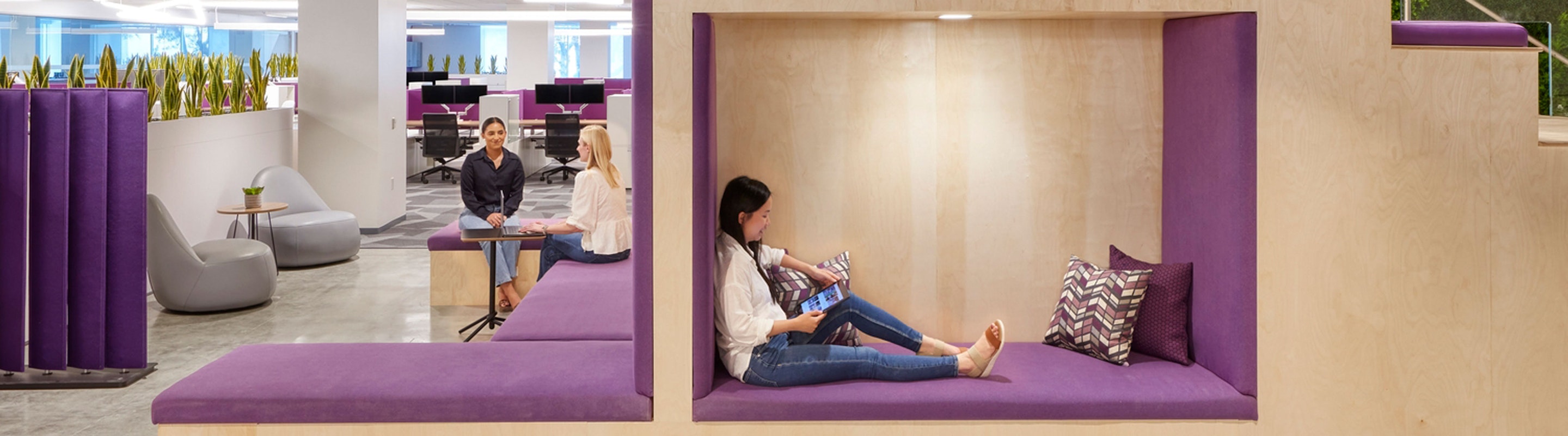
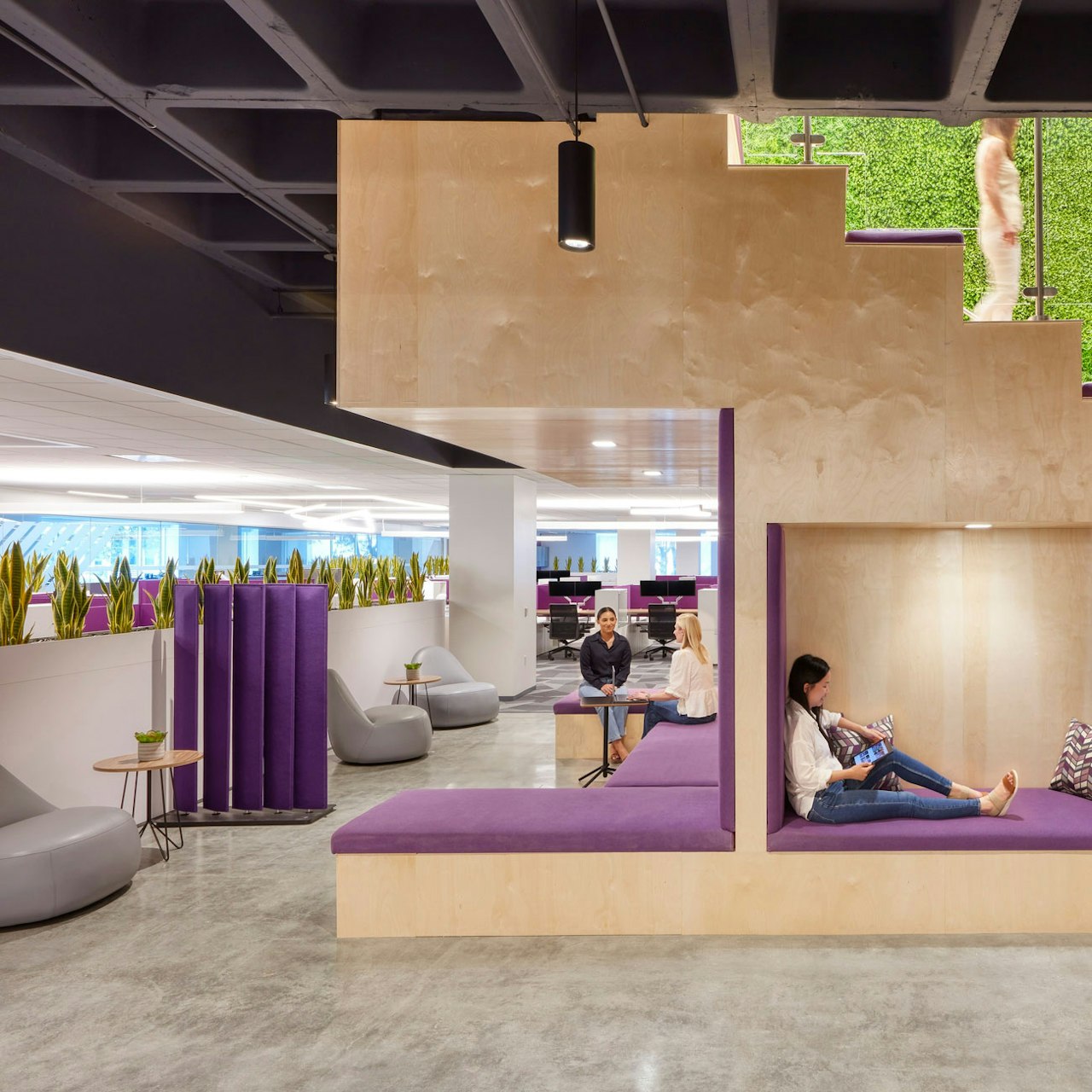
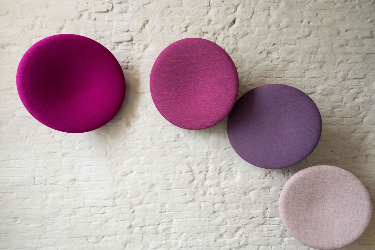
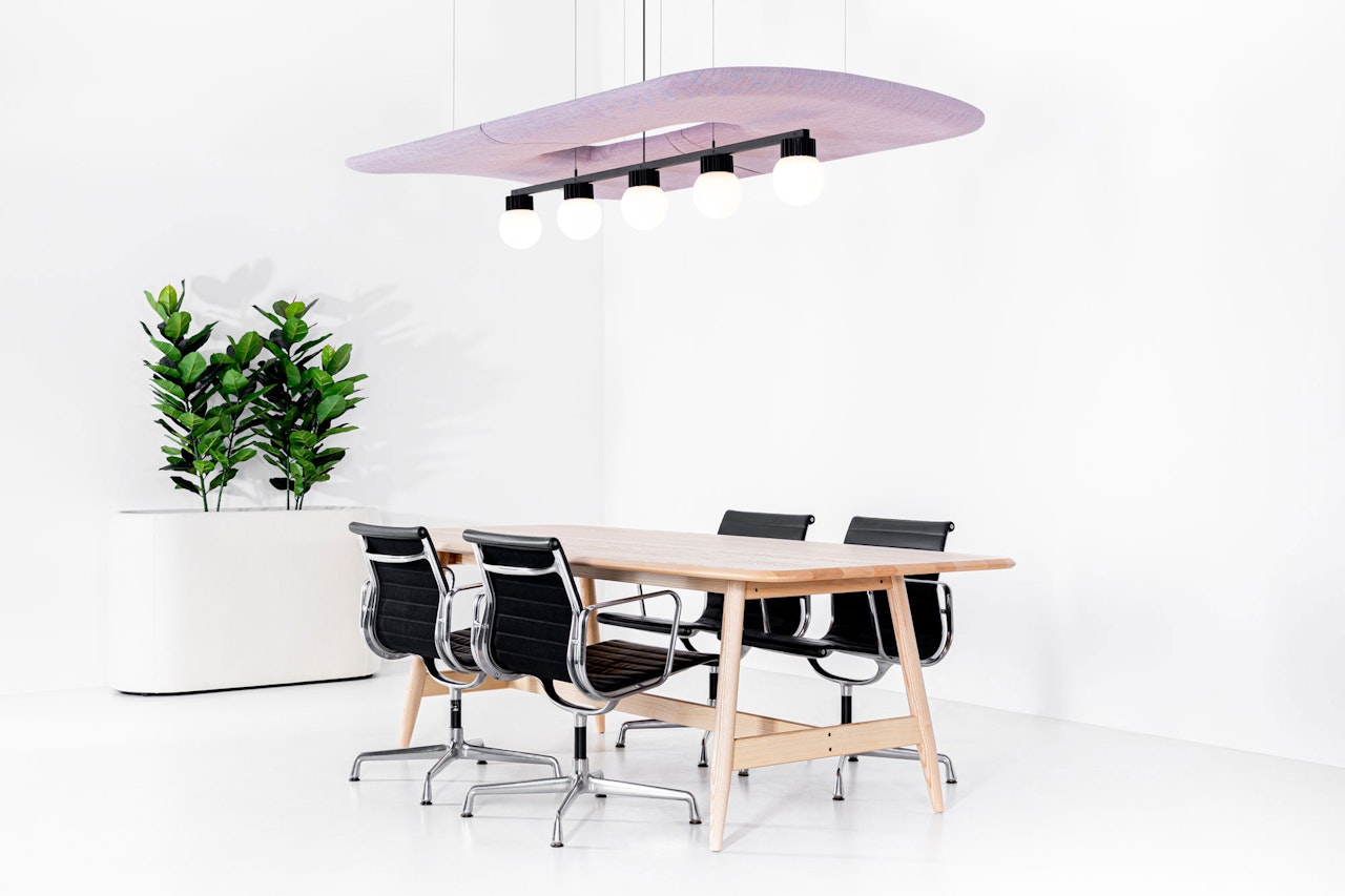
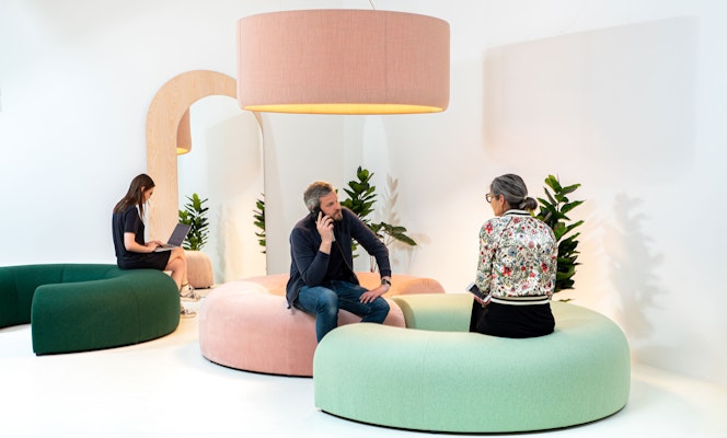
Easily incorporate “Very Peri” inspired acoustic solutions into your Hubs for Togetherness.
In December of last year, global color authority Pantone revealed its 2022 Color of the Year selection: “Very Peri.” The chosen color represents change and growth.
“As we move into a world of unprecedented change, the selection of Pantone 17-3938 ‘Very Peri’ brings a novel perspective and vision of the trusted and beloved blue color family, encompassing the qualities of the blues,” describes Leatrice Eiseman, Executive Director of the Pantone Color Institute. “Yet at the same time with its violet red undertone, PANTONE 17-3938 ‘Very Peri’ displays a spritely, joyous attitude and dynamic presence that encourages courageous creativity and imaginative expressions.”

The periwinkle, purple tone of “Very Peri” illustrates how modern life is adapting and how color trends in the digital world are being translated into real life. “‘Very Peri’ is a symbol of the global zeitgeist of the moment and the transition we are going through,” Pantone shared in a statement.
“The Pantone Color of the Year reflects what is taking place in our global culture, expressing what people are looking for that color can hope to answer,” adds Laurie Pressman, vice president of the Pantone Color Institute. “Creating a new color for the first time in the history of our Pantone Color of the Year educational color program reflects the global innovation and transformation taking place.”

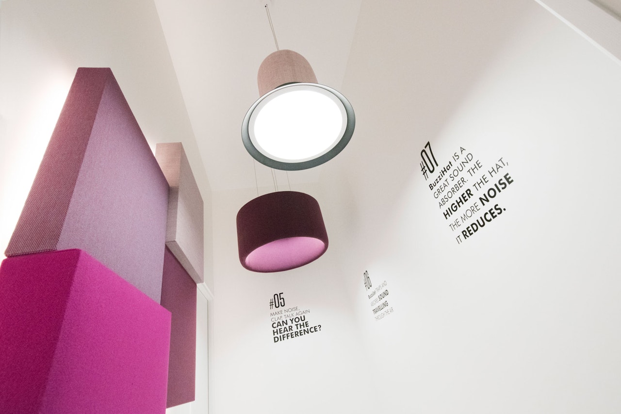
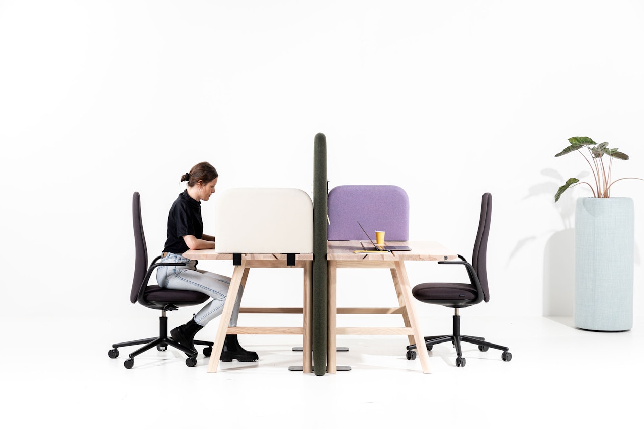
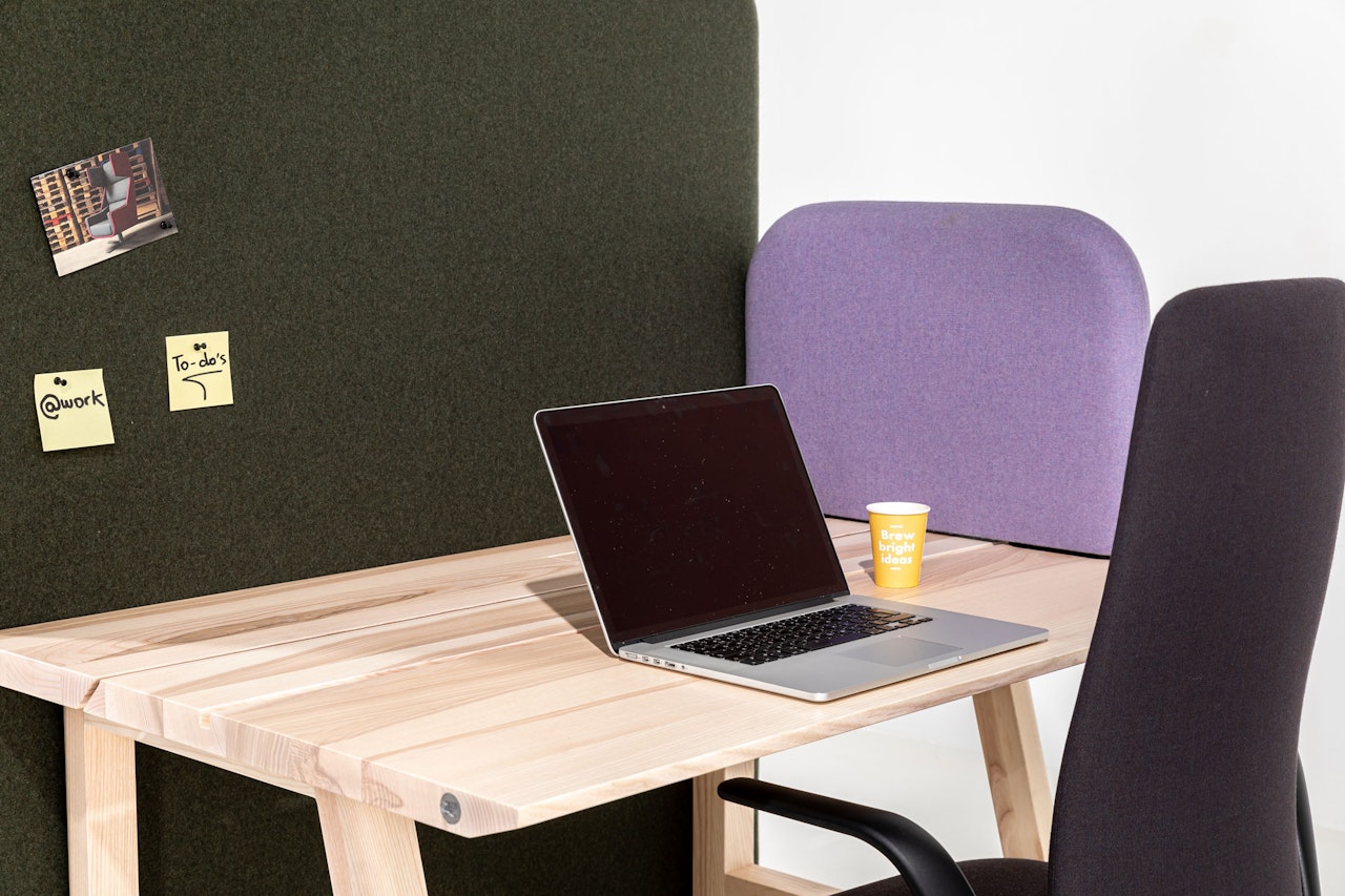
Looking for ways to introduce the happy and warm “Very Peri”-inspired hue into your workspace while improving acoustics at the same time? Then our selection of acoustic solutions might just be what you’re looking for. Additionally, make sure to discover our range of felts and fabrics.
Projects
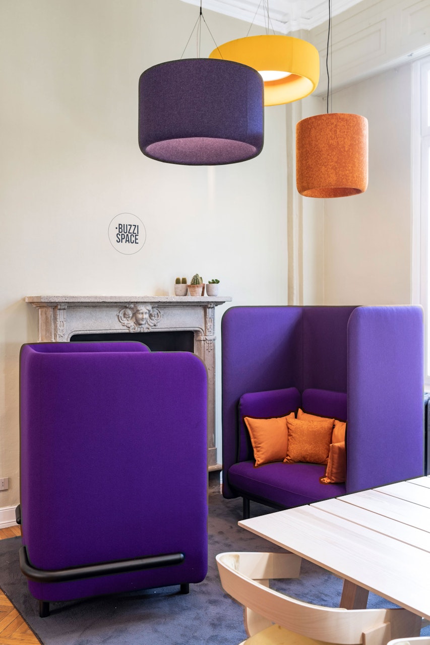

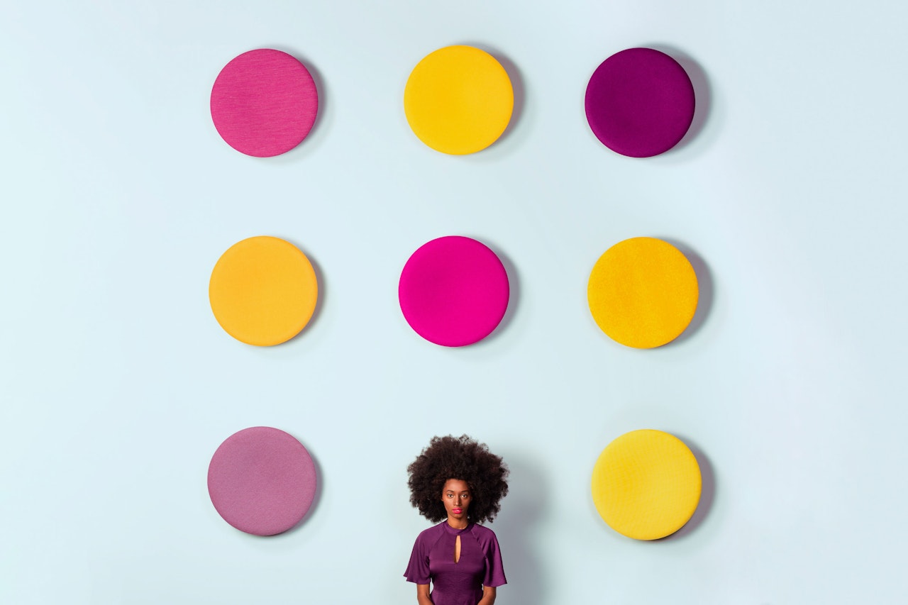
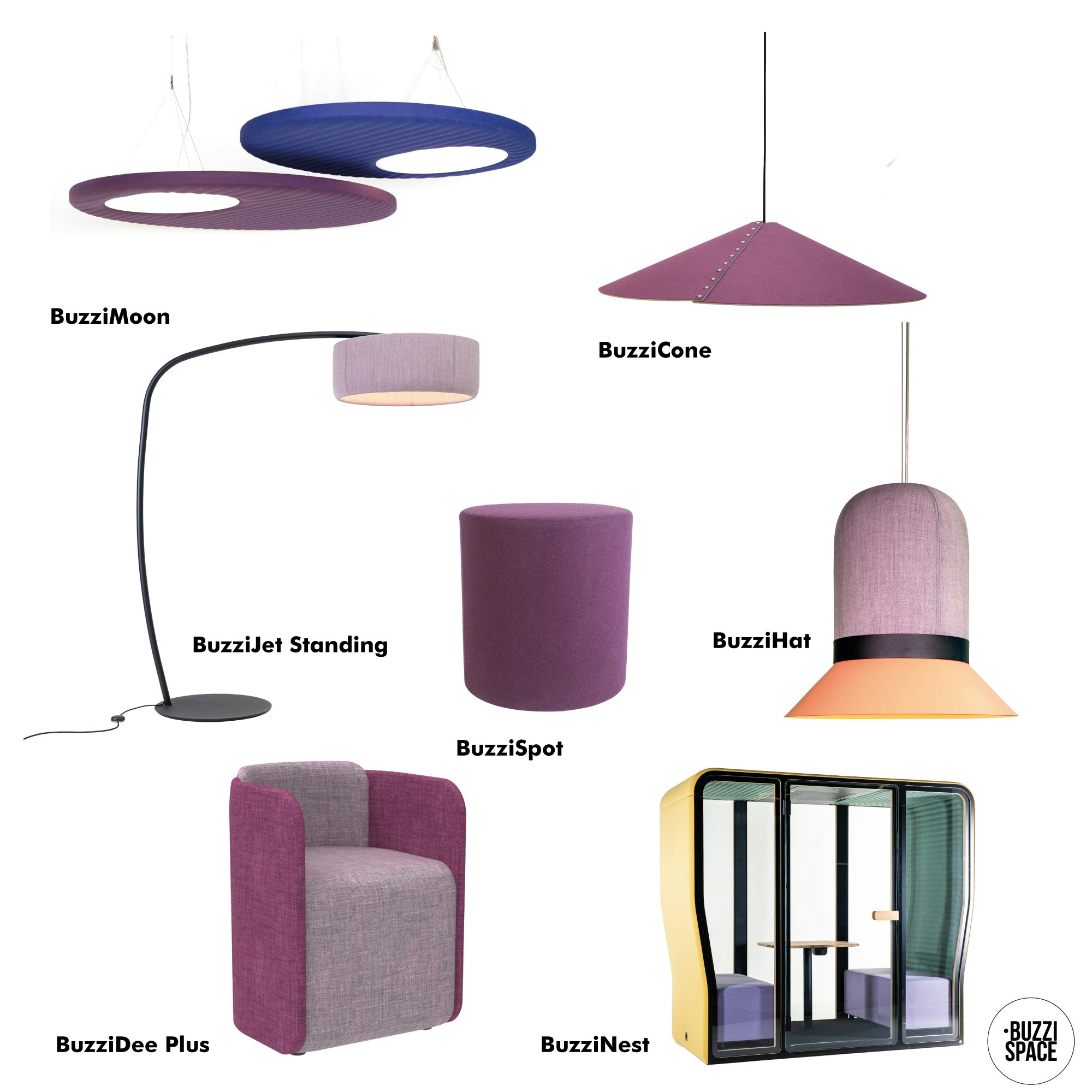
Showcased in the above image: BuzziMoon, BuzziCone, BuzziJet Standing, BuzziSpot, BuzziHat, BuzziDee Plus, BuzziNest.
Add some “Very Peri” inspired hues into your workspace now.
Related articles
5 Seating Elements to Create Hubs for Togetherness
Flexible acoustic seating solutions to help design areas for informal meetings and collaborations, all while encouraging a sense of togetherness.
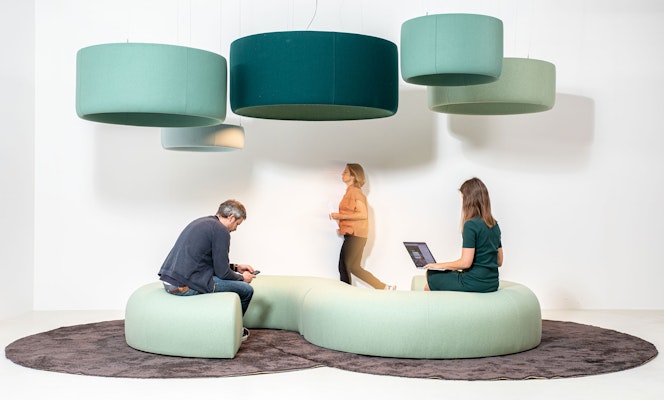
12 Lighting Solutions That Will Create a Sense of Togetherness
Find the perfect lighting solution, whether it be for a reception area, collaboration zone, meeting spot, or social space.
Solutions to Create Hubs for Togetherness
Hubs for Togetherness is our creative philosophy that defines and stimulates ways of hybrid working. So, what do we have to consider when creating Hubs for Togetherness for employees coming back to the office eager to experience that spirit?